Font Analysis
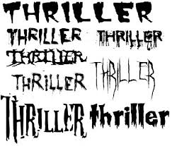
Thriller font are typically meant to be spooky and ominous. This is to let the audience already have a eerie feeling when looking at the title. The title font can affect the whole feel of a movie poster, therefore by deciding what text you have can immediately decide the genre of your film.
 Psycho

The font used on this movie poster is typical of the thriller genre. The title of the film is in bold and capitalised, immediately standing out to the audience. It has the expected font, an effect that gives it a slight mystery. The cracks in the 'c' of psycho could represent cracks and instability throughout the film. Also there's a huge line going through the title. This could also symbolise instability but as the title is 'Pyscho' something that usually refers to someone losing their mind or having two sides to them; a split personality. The line could represent the two different sides of the antagonist, already creating tension and mystery for the audience. The font colour of yellow co-incides with a colour theme as the woman has a yellow filter over her photo. But yellow usually represents light and hope so is therefore breaking stereotypes and conventions of having at typically dark title.
Furthermore, the font of the actors is different to the main title. This is so the title stands out more. The text is typically thriller-like having elongated letters and skinny text.
Jaws

Jaws also coincides with typically thriller font as it again is in capitals, immediately drawing the audience straight to the title. Moreover, the font is in bright red, red already symbolises blood and death, already foreshadowing the chain of events that are about to unfold. Furthermore, the font has both sharp and rounded edges. The sharp edges could symbolise the sharp teeth of 'Jaws', representing the danger and scariness of the shark. The rounded edges on the 'J' could represent the dorsal fin of the shark that appears on top of the water surface.
